Tribute to Typeface – DIN
Editorial Design
- Year
- 2012
- Client
- conceptual project
- Services
- Editorial Design
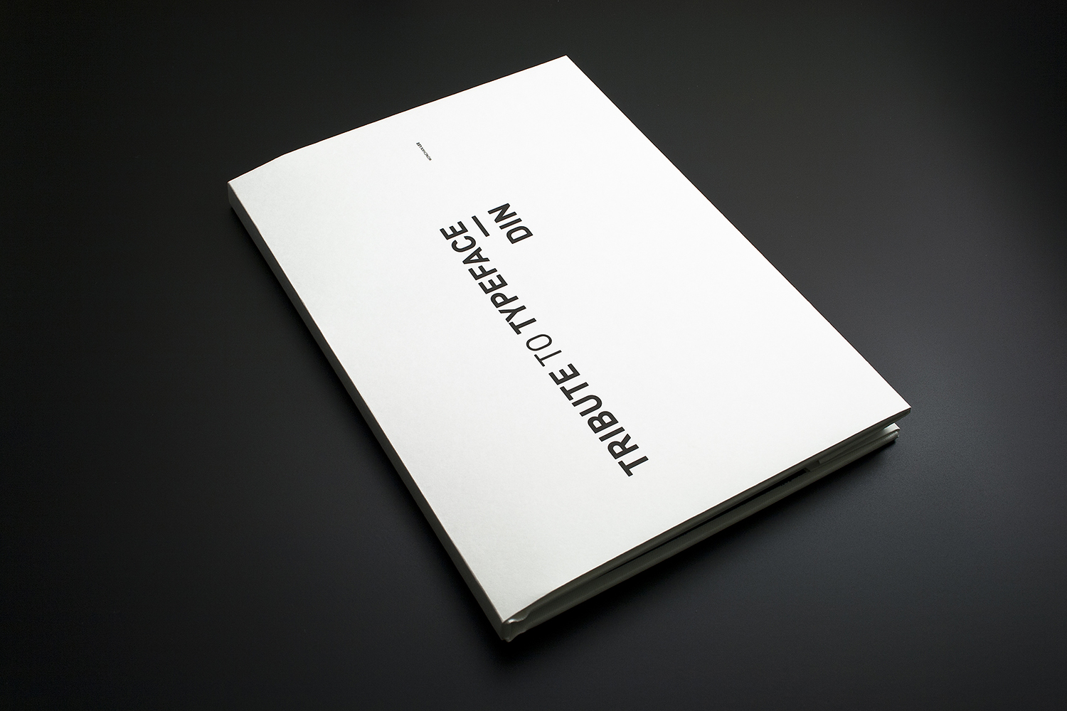
Type is everywhere. We read it, write it, draw it and type it. DIN is one of the many typefaces widely embraced by designers around the world.
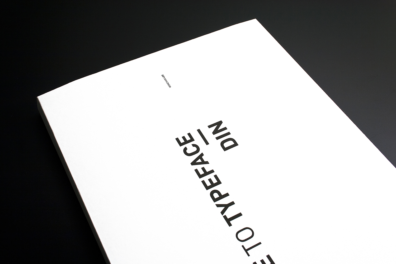
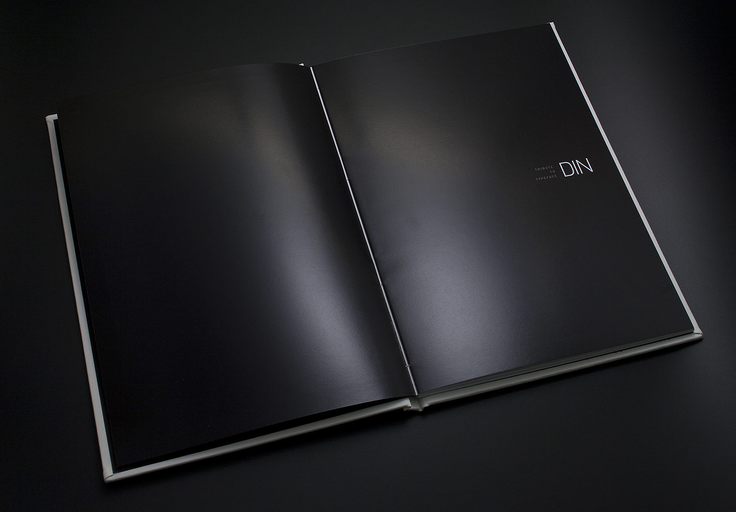
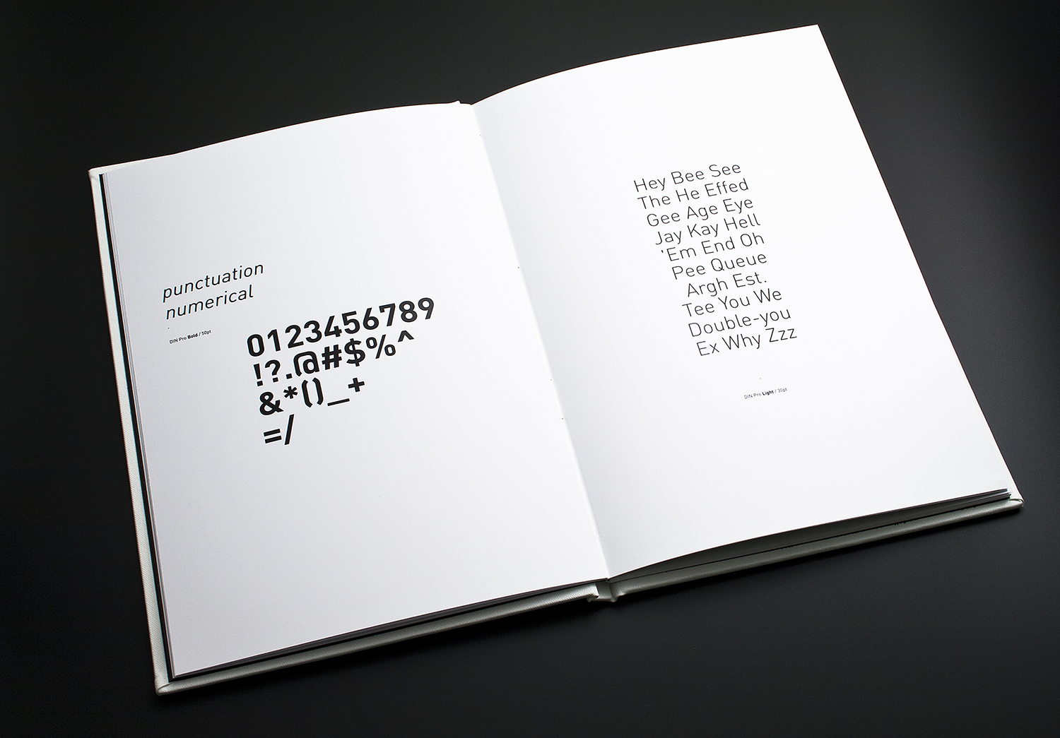
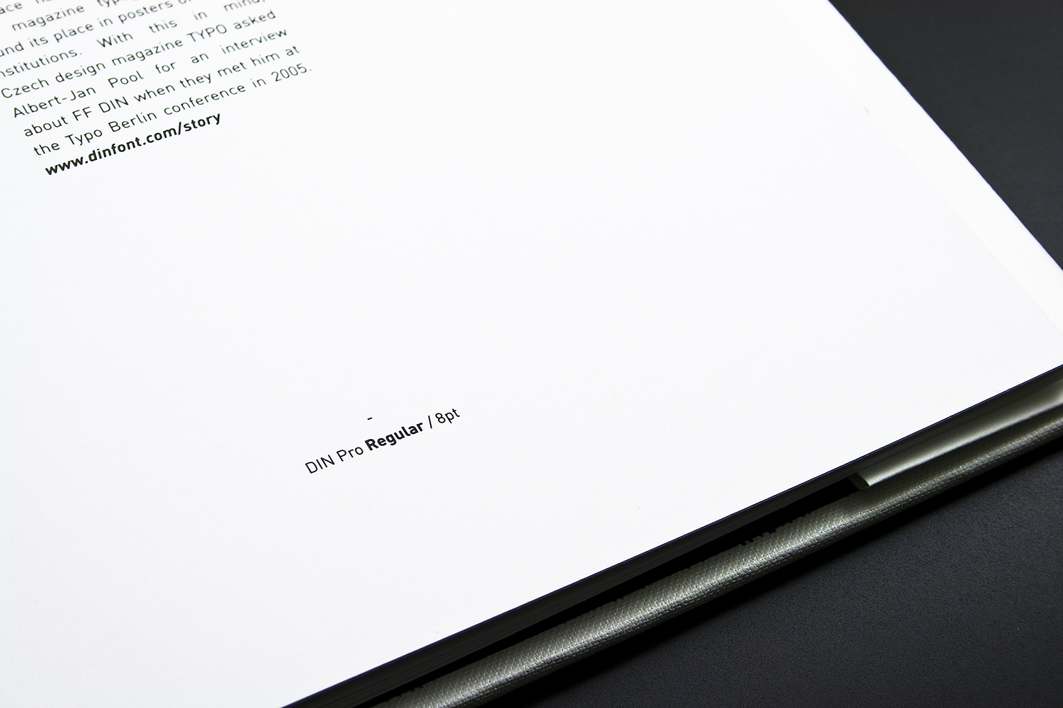
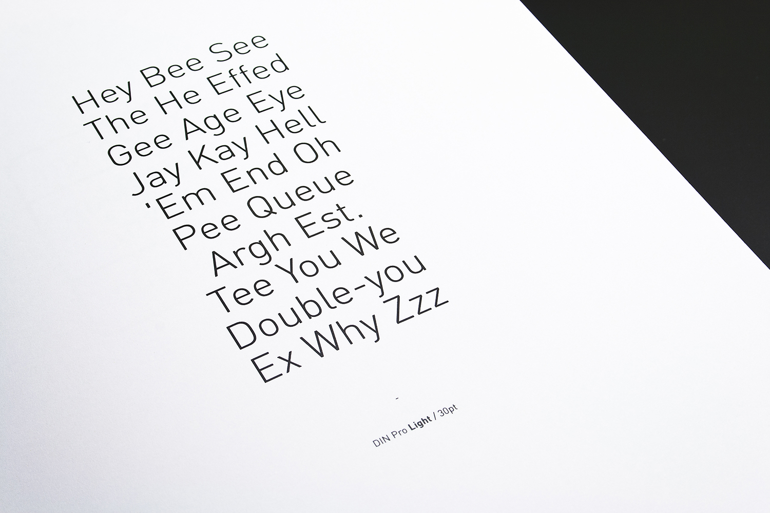
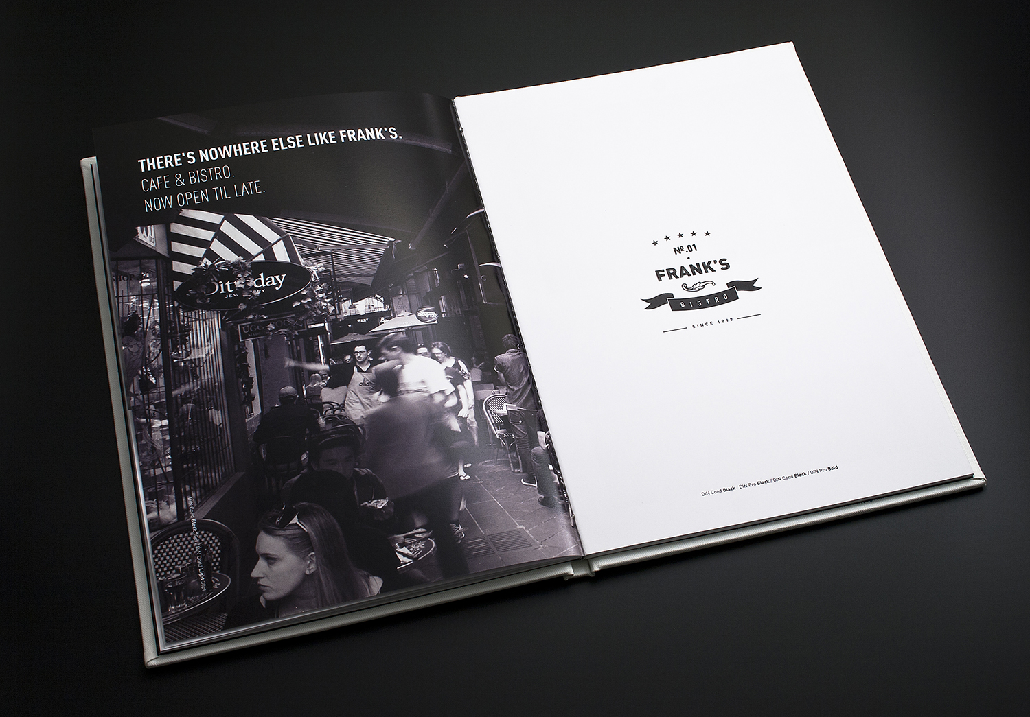
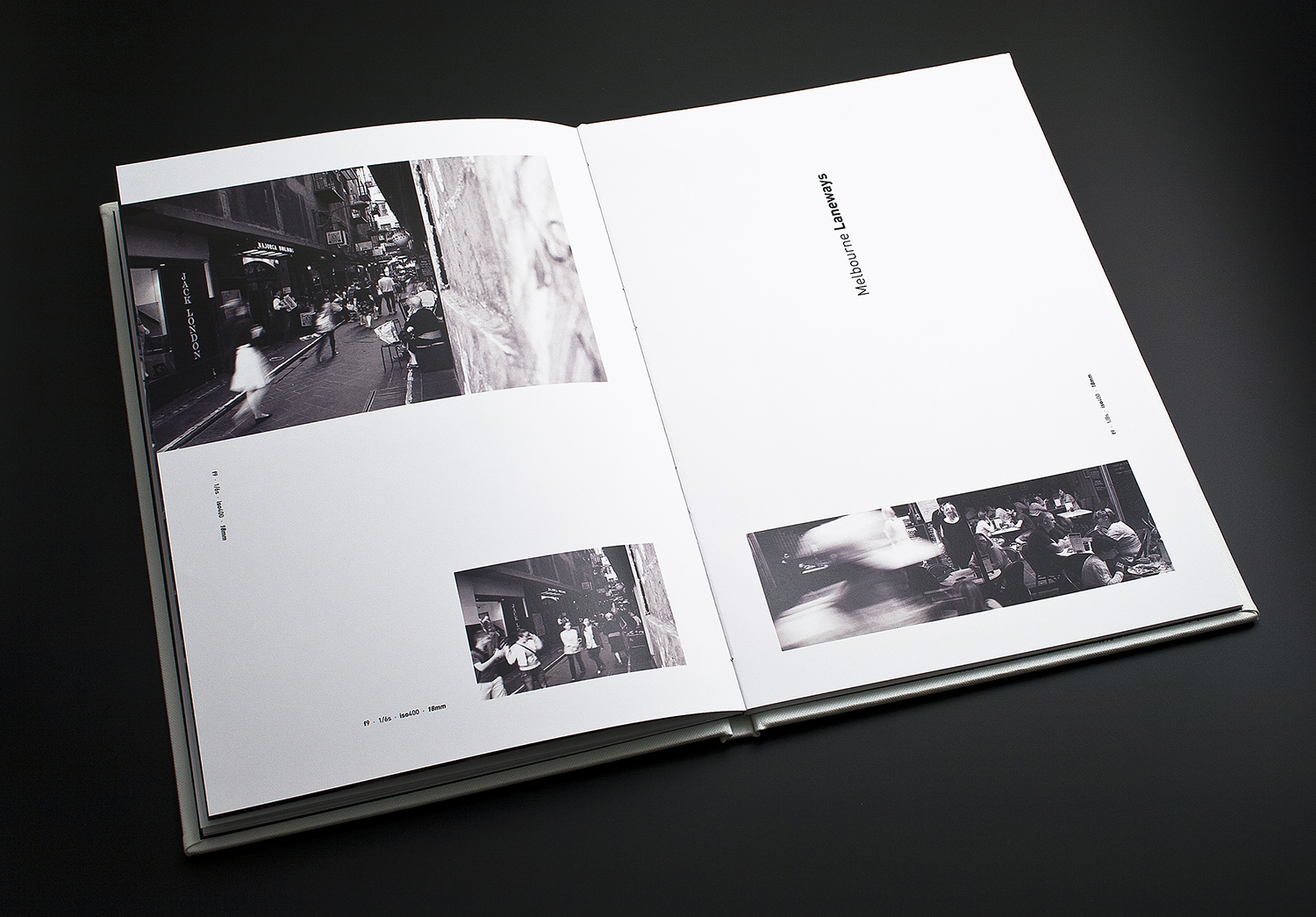
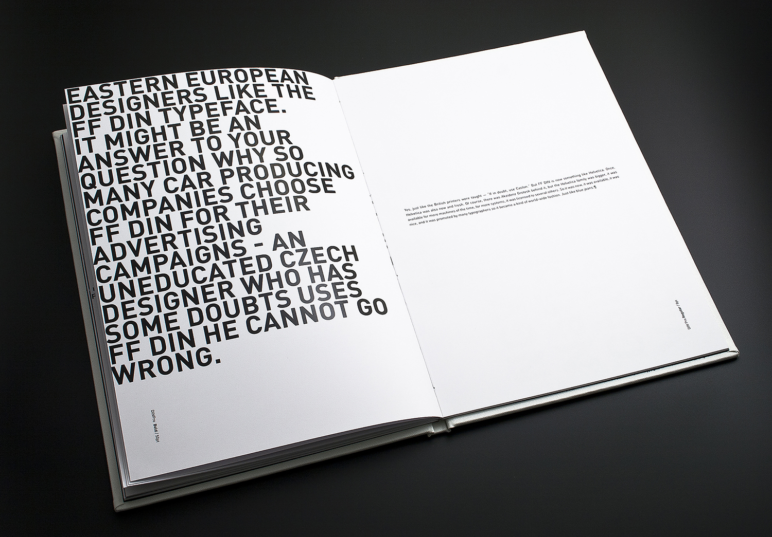
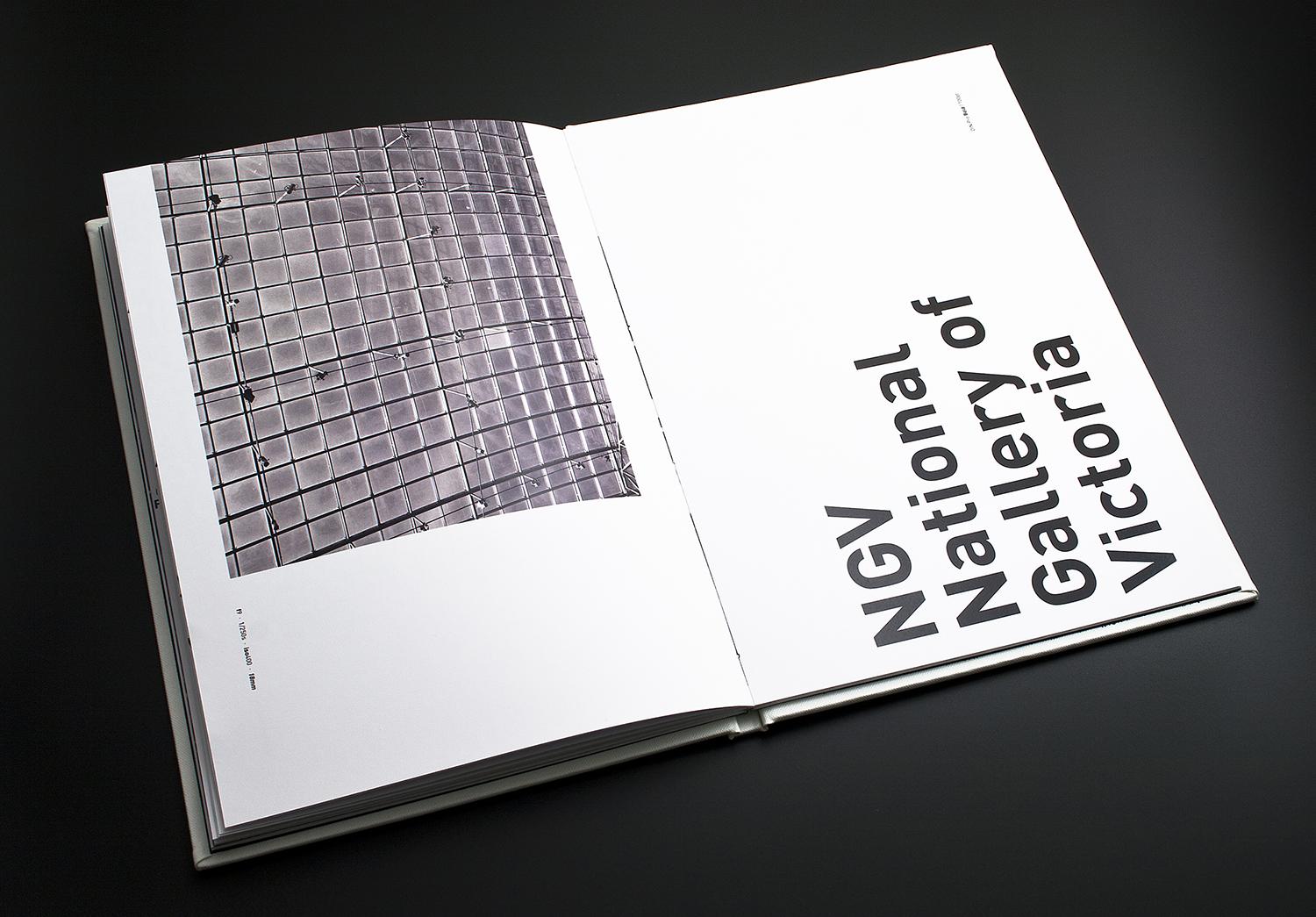
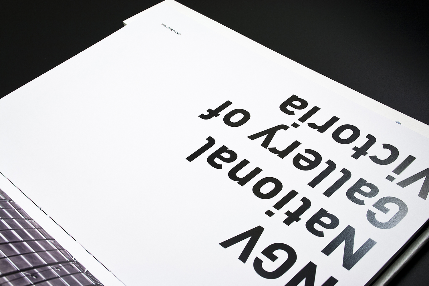
The first book in our ongoing Tribute to Typeface series explores DIN's origins, design history, formal characteristics and versatility through a range of applications.
Hardcover / section-sewn / custom binding
205 × 290 mm
활자는 일상 곳곳에 있습니다. 우리는 활자를 읽고 쓰고 그리며 입력합니다. DIN은 전 세계 디자이너들에게 널리 사랑받는 서체 중 하나입니다.
장기 프로젝트 ‘Tribute to Typeface’의 첫 번째 책으로, DIN의 기원과 디자인 배경, 형태적 특성, 다양한 활용 사례를 살펴봅니다.
양장 / 실 제본 / 커스텀 제본
205 × 290 mm