H TEA
Branding, Packaging and Space Direction
- Year
- 2014
- Client
- Zworks Company
- Services
- Branding / Packaging
- Creative Direction / Design / Photography
- Wonchan Lee
- Editorial Design
- Youngeun Kim
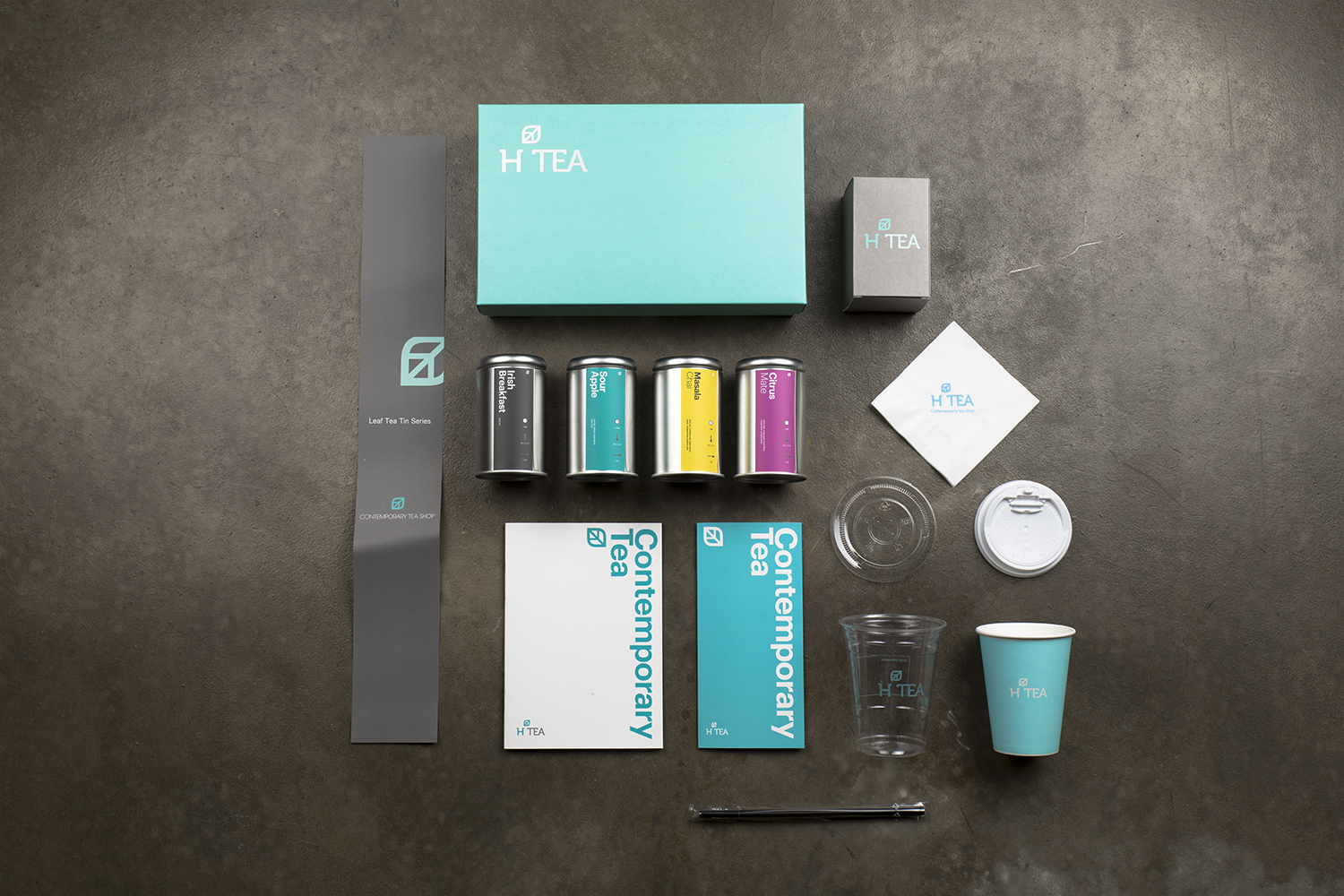
H Tea is a contemporary tea brand launched in August 2014.
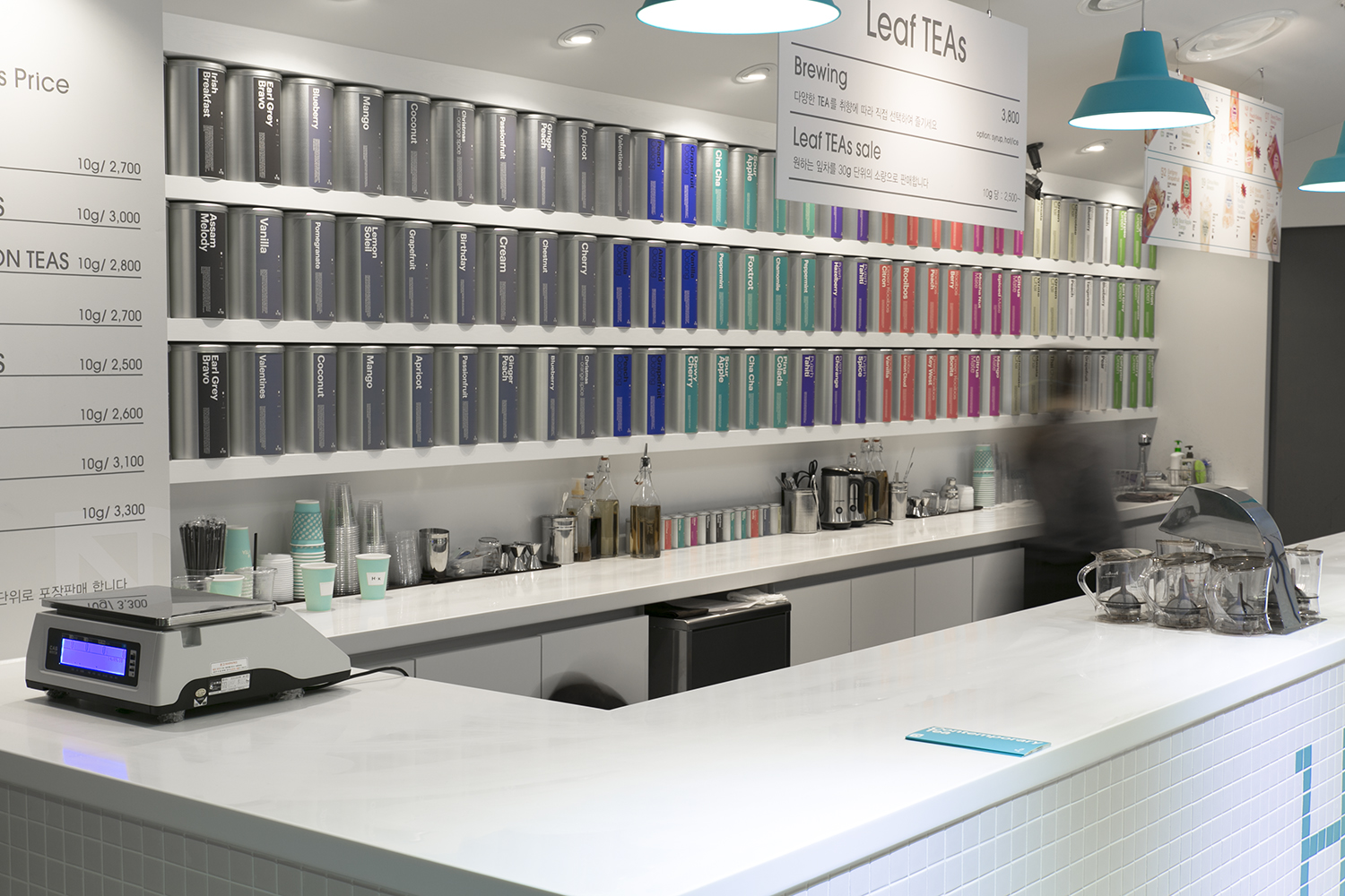
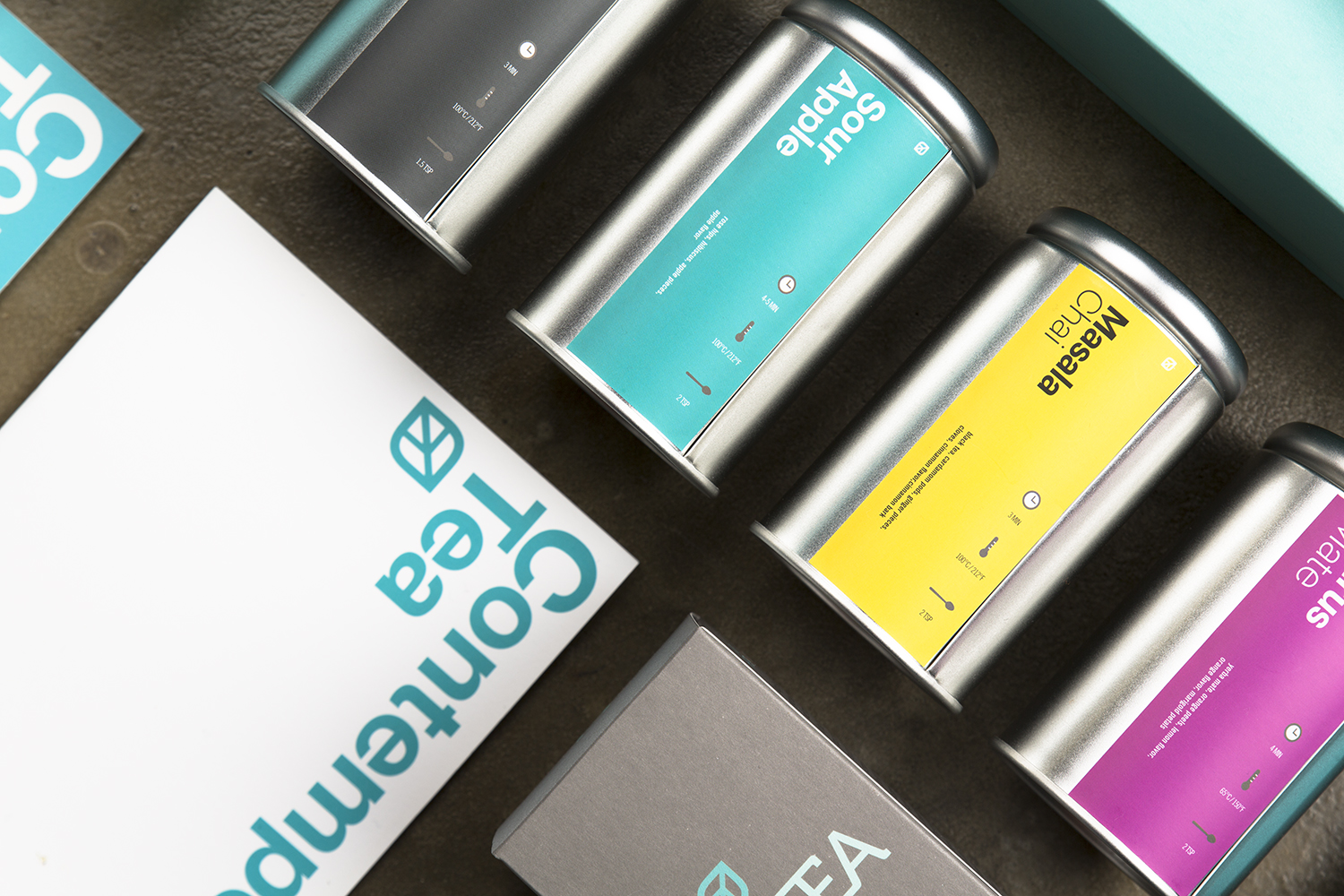
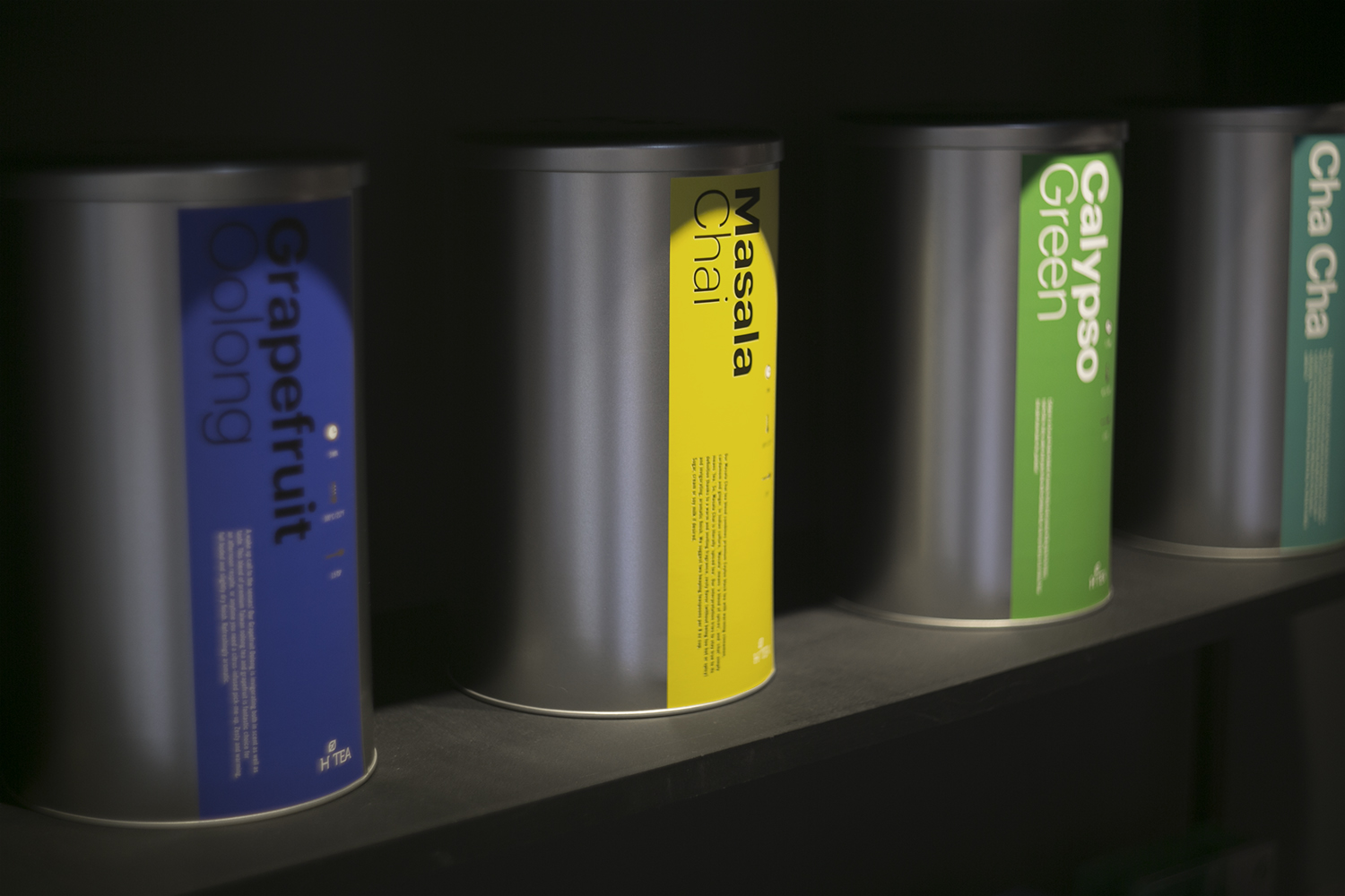
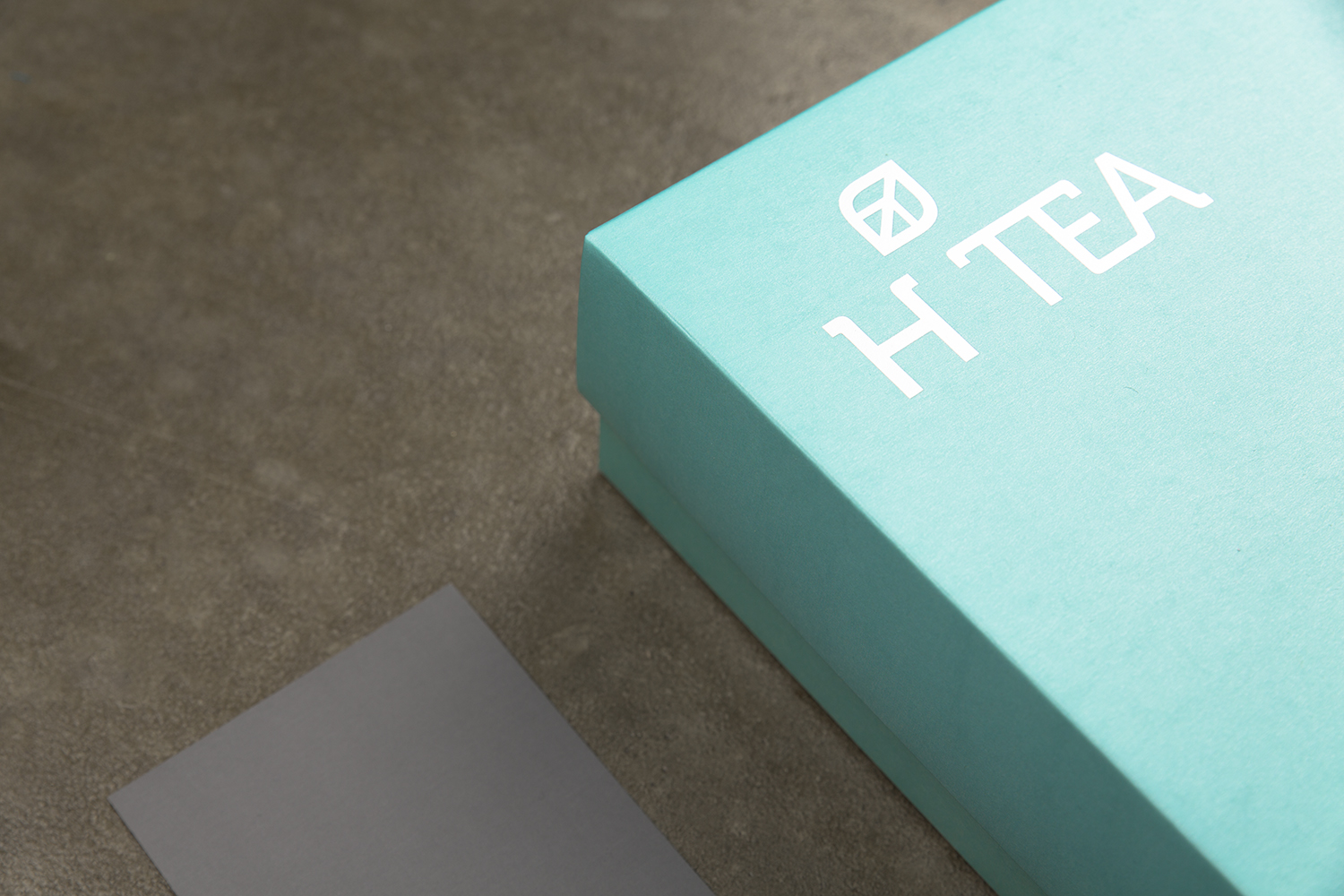
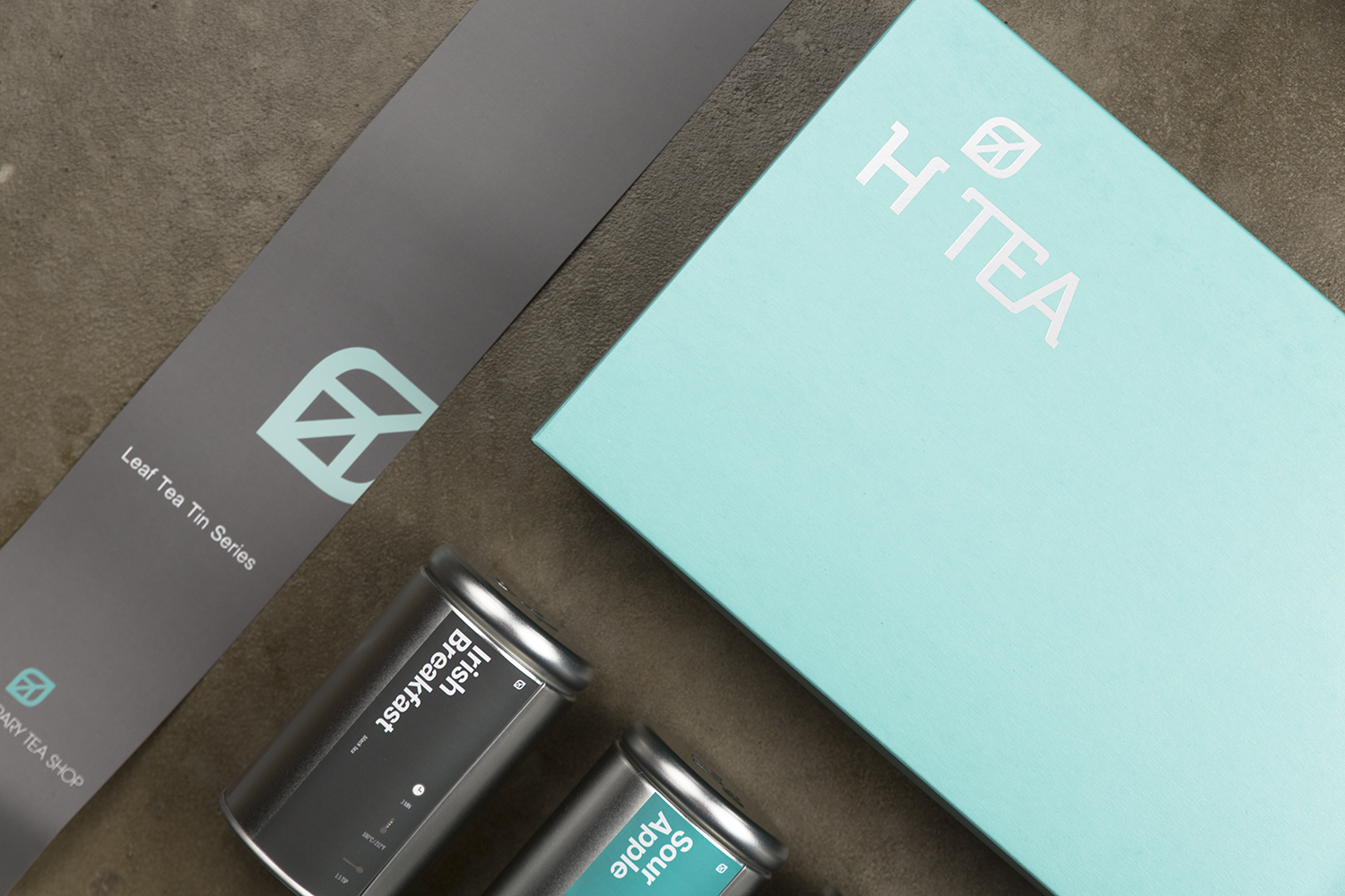
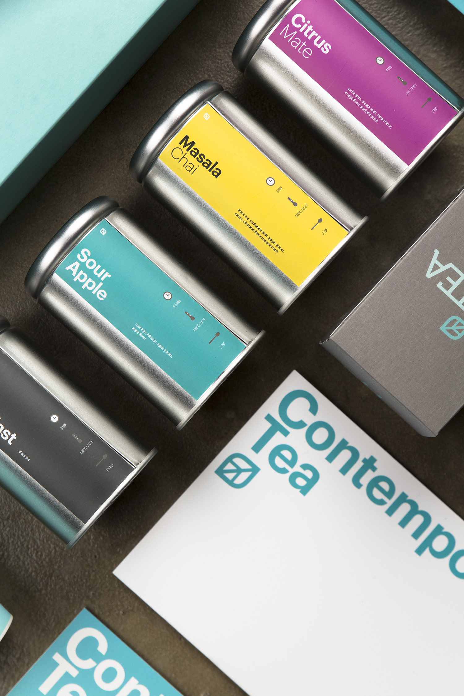
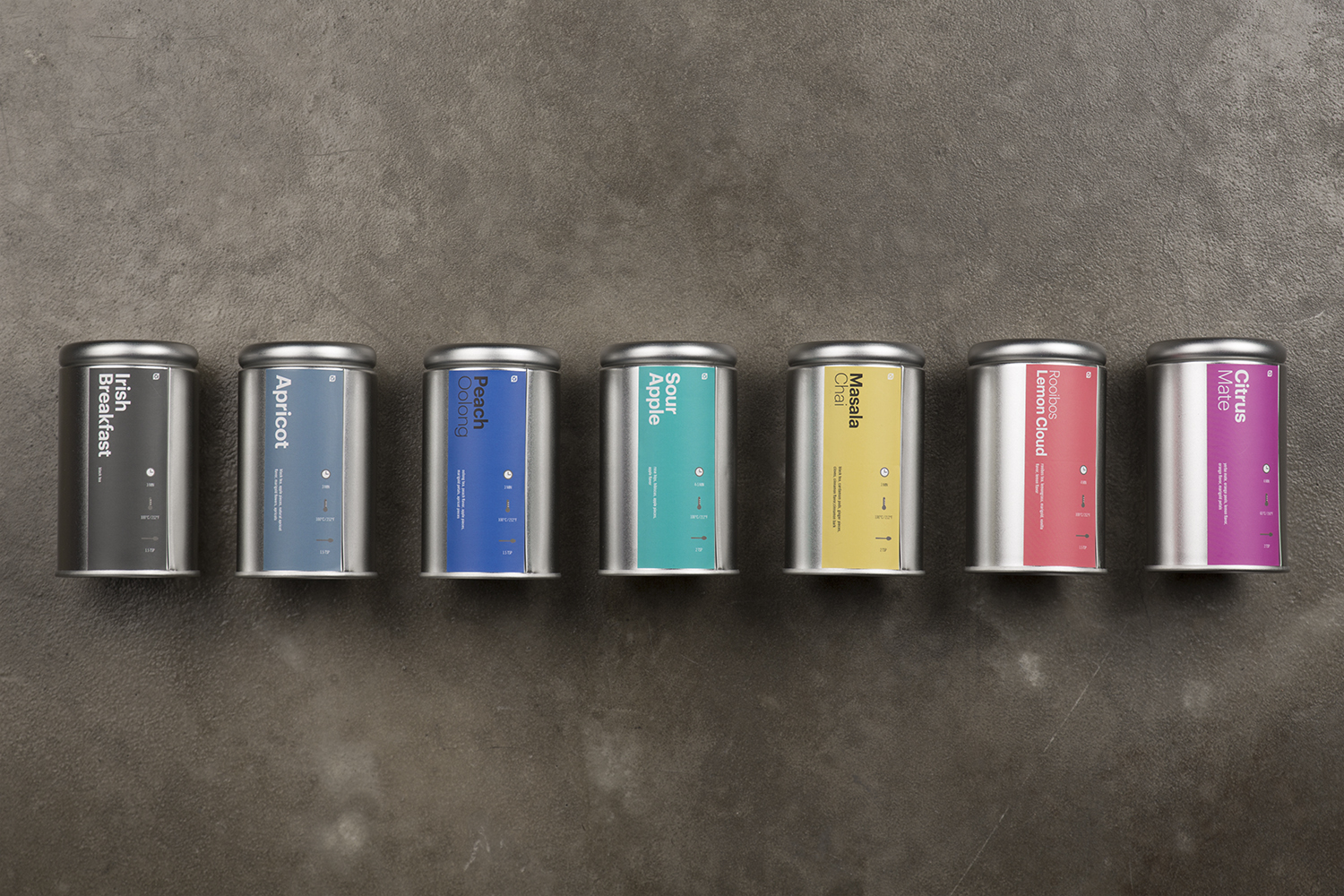
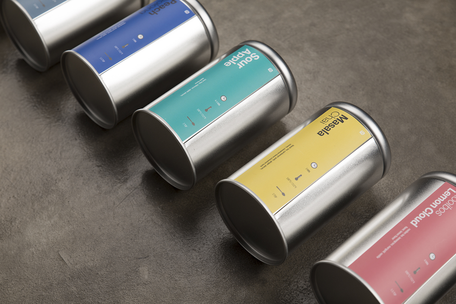
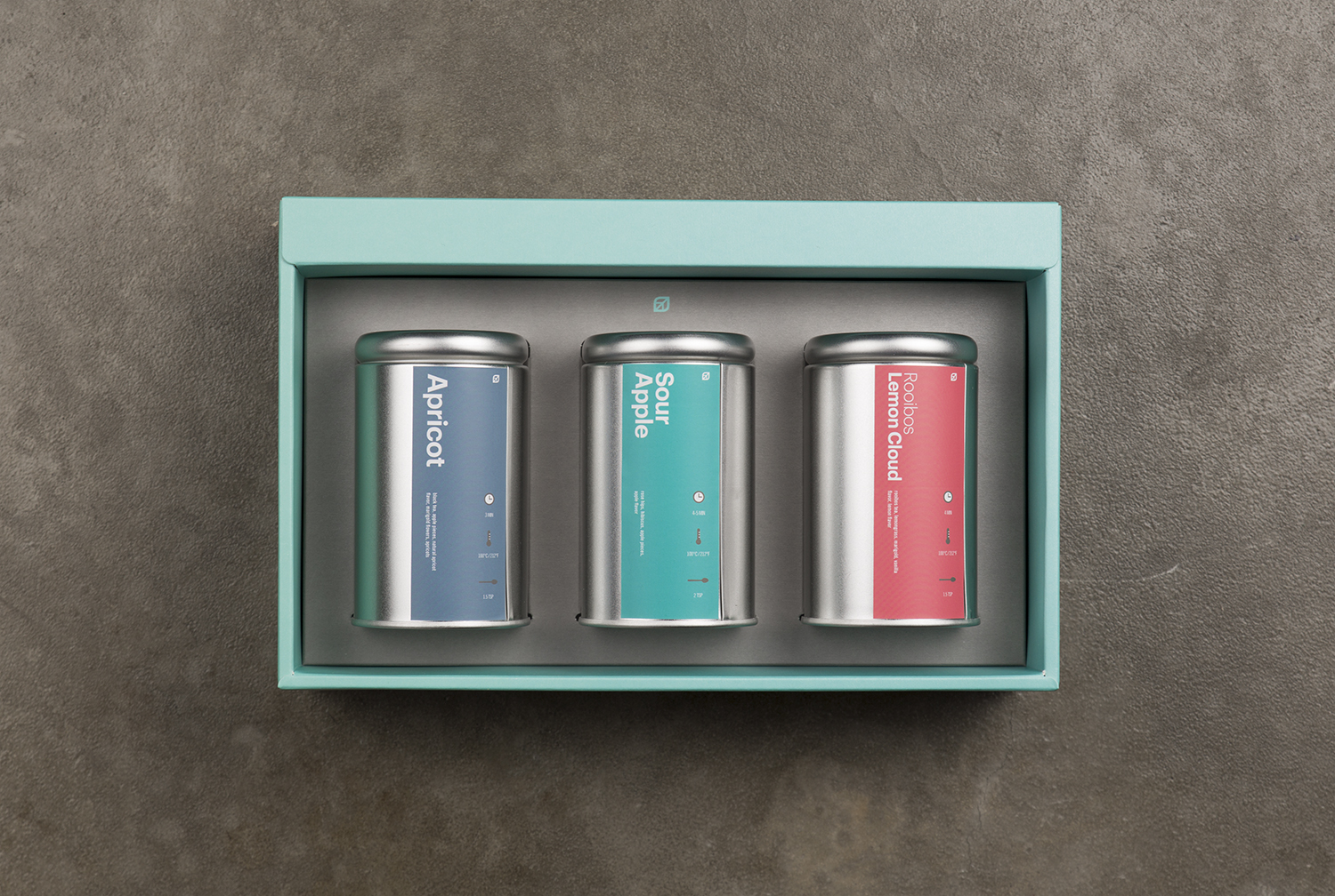
The identity combines the initial H with the form of a tea leaf, making it easy to read and remember. A colour-coding system distinguishes the tea collection, with turquoise as the primary colour and ten supporting colours connecting the range.
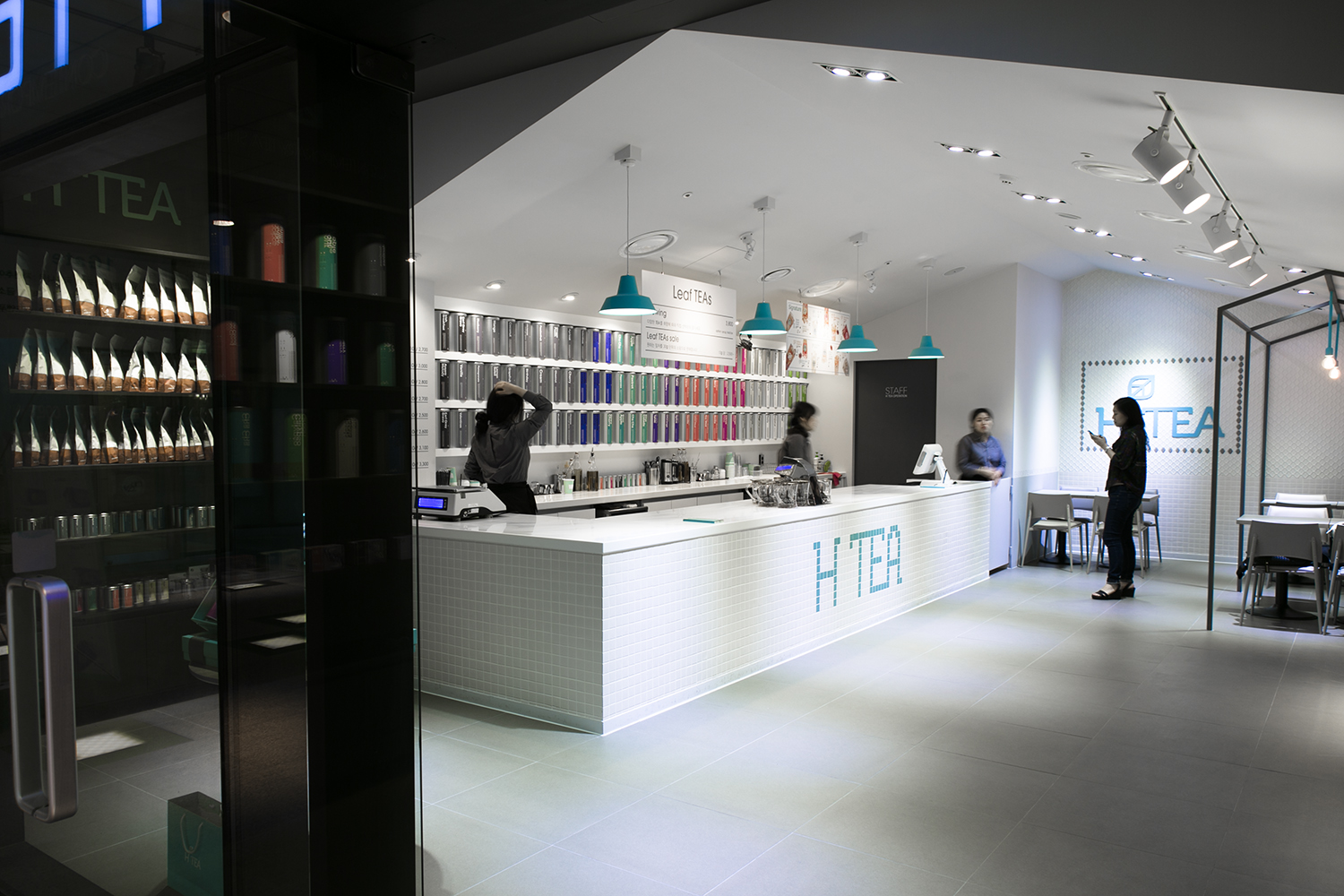
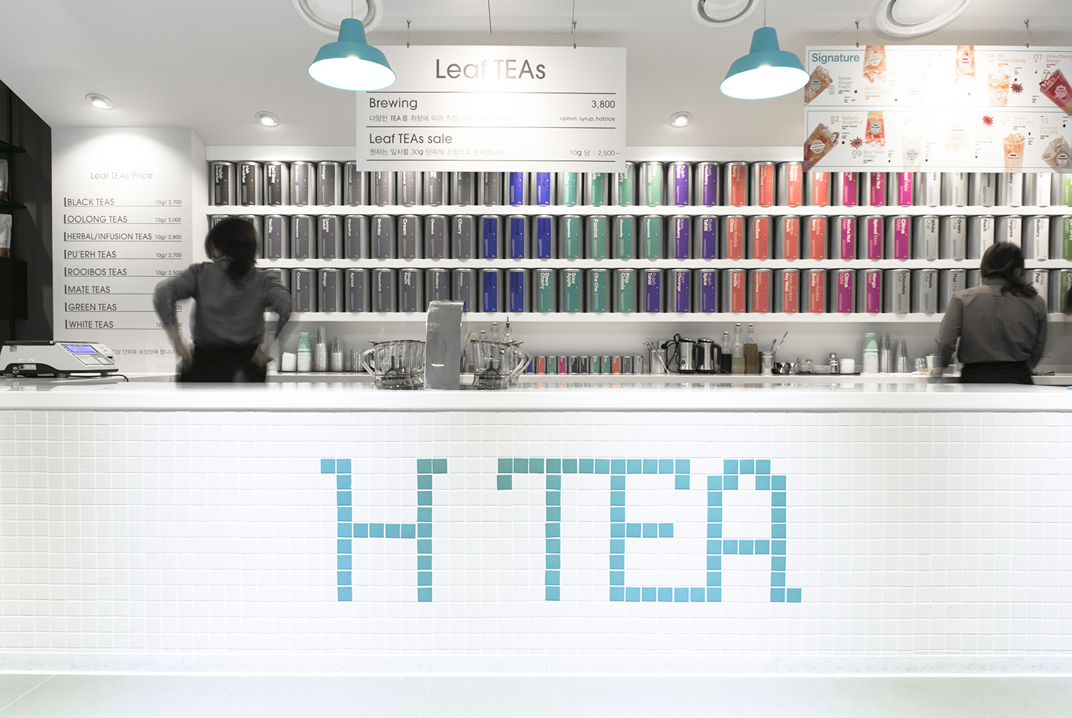
The first flagship store was created near the MBC headquarters in Sangam DMC, Seoul.
H Tea는 2014년 8월 시작한 컨템포러리 티 브랜드입니다.
쉽게 읽고 기억할 수 있는 아이덴티티를 위해 이니셜 H와 찻잎의 형태를 결합했습니다. 티 컬렉션을 직관적으로 구분할 수 있도록 색상 체계를 마련하고, 터쿼이즈를 주조색으로 사용했습니다. 열 가지 보조색으로 제품군을 연결했습니다.
첫 공간은 서울 상암 DMC의 MBC 본사 인근에 마련한 플래그십 스토어입니다.