minimalist collection
Branding
- Year
- 2013
- Client
- minimalist
- Services
- Branding
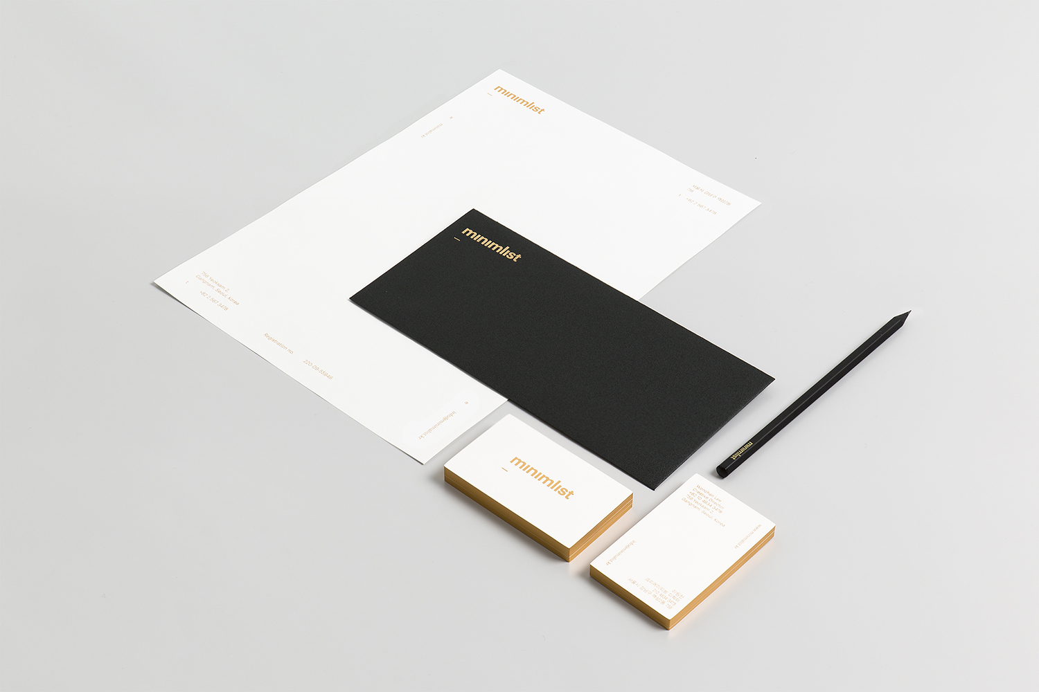
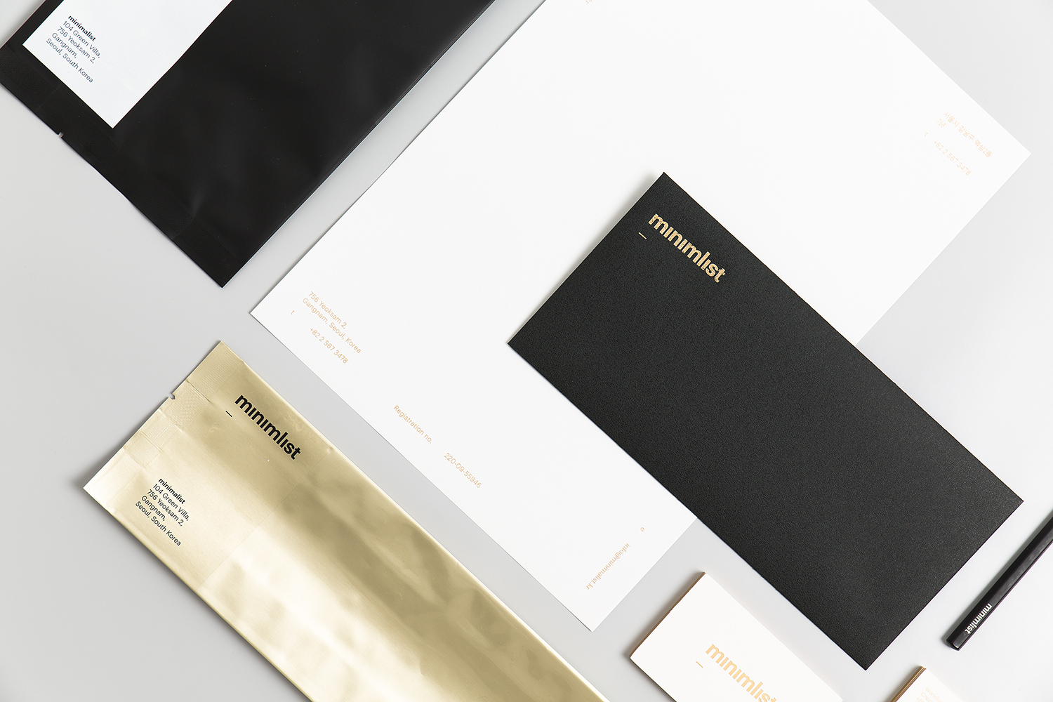
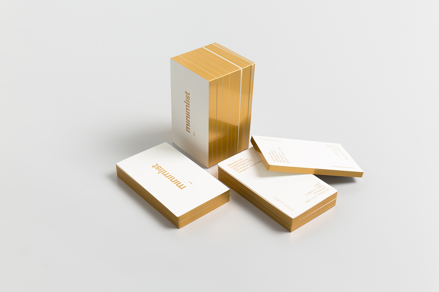
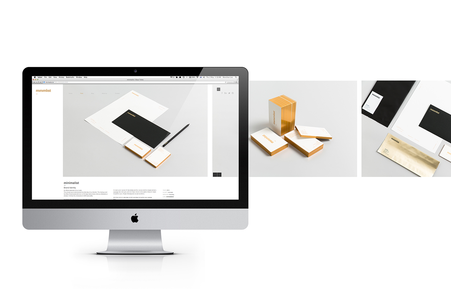
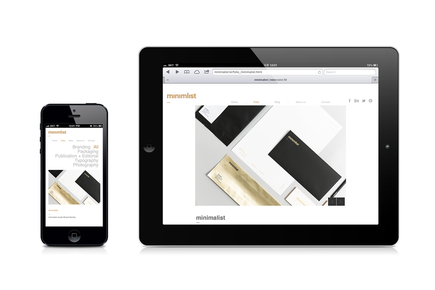
An official branding project to celebrate launch of minimalist studio.
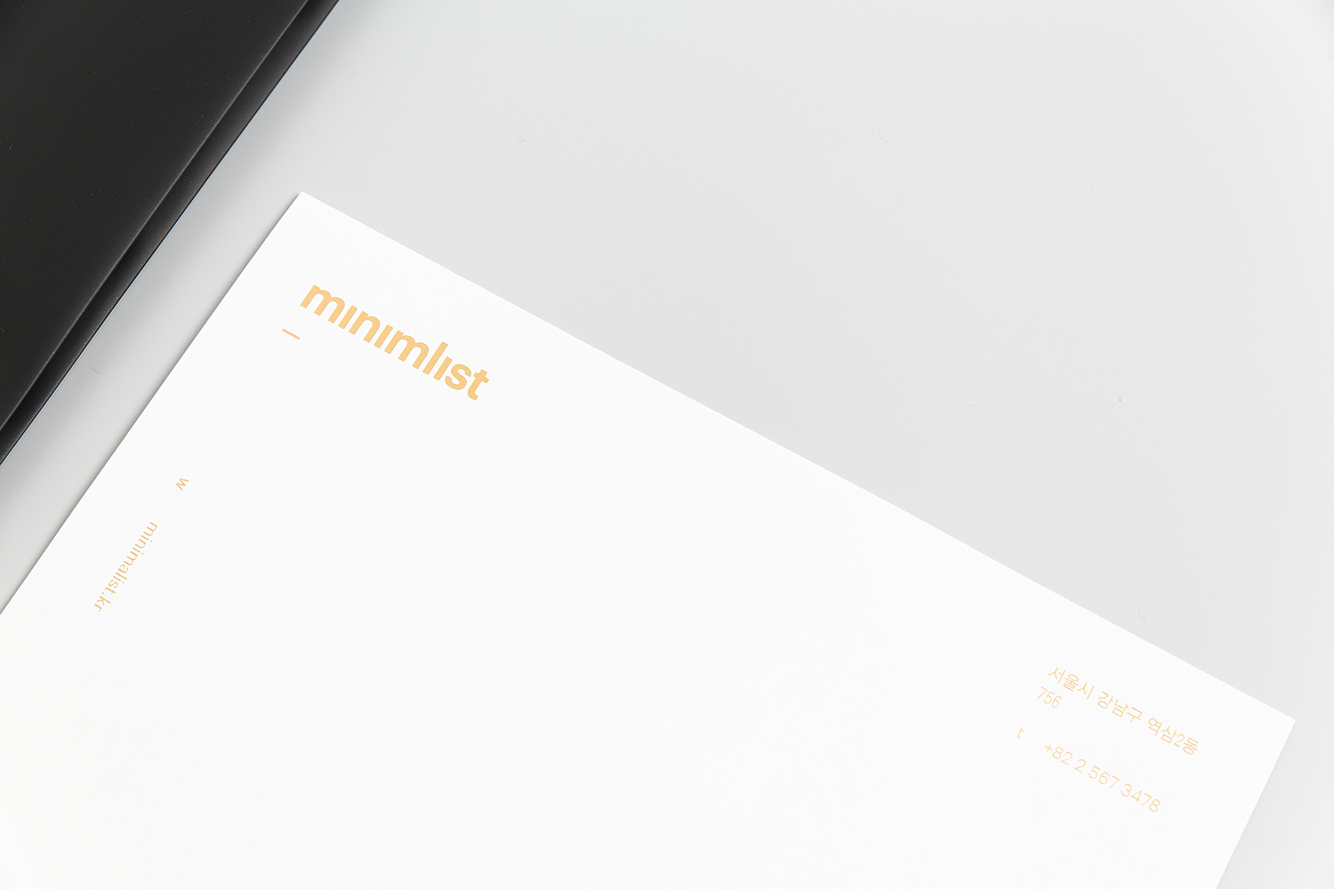
The concept was to demonstrate the whole idea of our philosophy and the direction we want to achieve. The missing a and two titles of lowercase i (a dot over i ) of the logo clearly show what our philosophy is all about: minimise the unnecessity to fulfil impeccability (Of course, it still reads 'minimalist').
미니멀리스트 공식 런칭을 기념하는 브랜딩 프로젝트.
미니멀리스트가 앞으로 추구할 방향과 가치를 직접 보여주자는 것이 전체적인 컨셉의 목적이다. minimalist 에서 빠진 a 와 소문자 i 의 두점이 우리의 디자인 철학이 무엇인지 극명하게 말해주고 있다: 무결을 위해 불필요한 요소를 최소화하다.